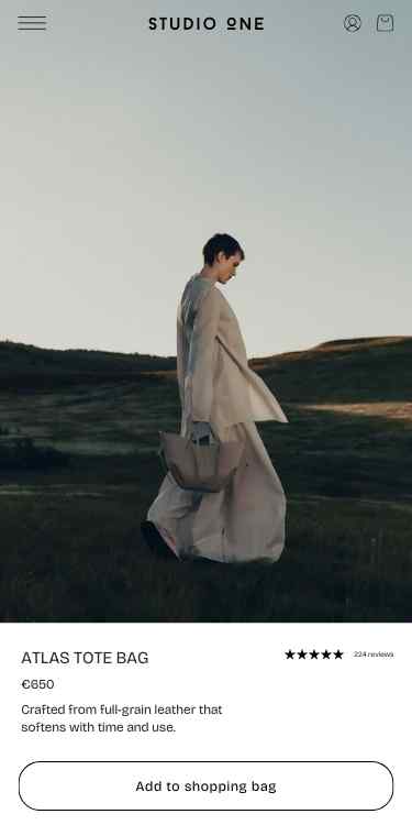
A defined summer visual language
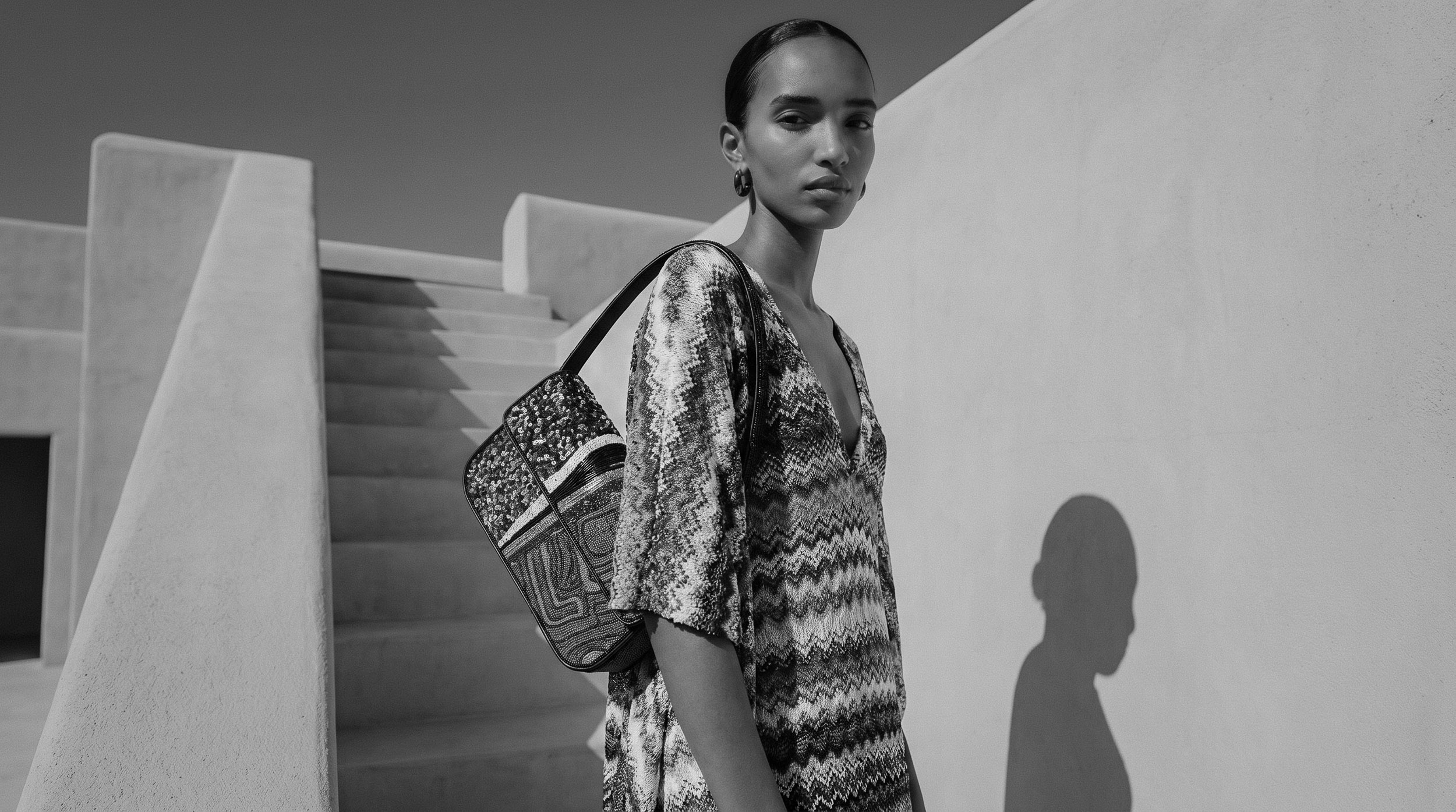
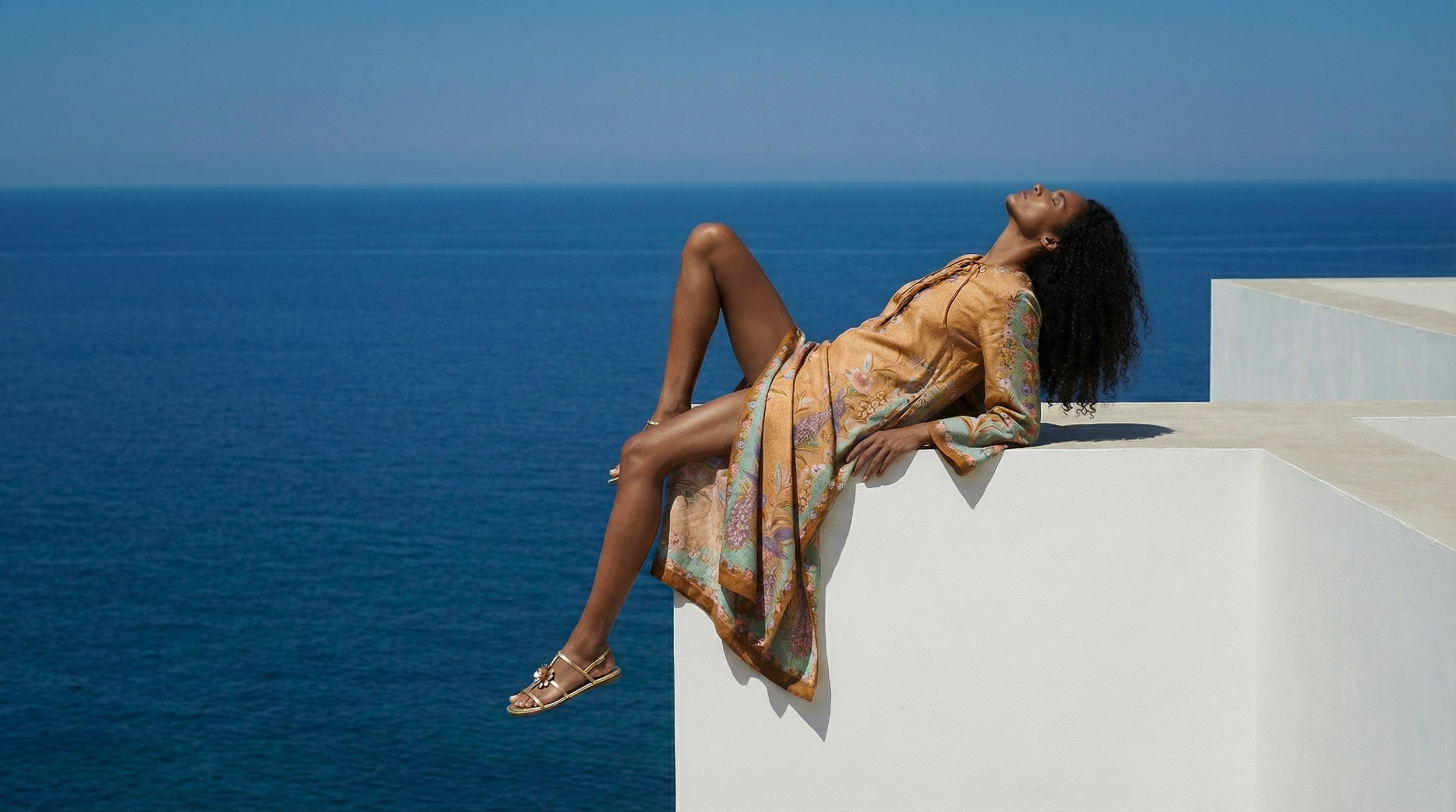
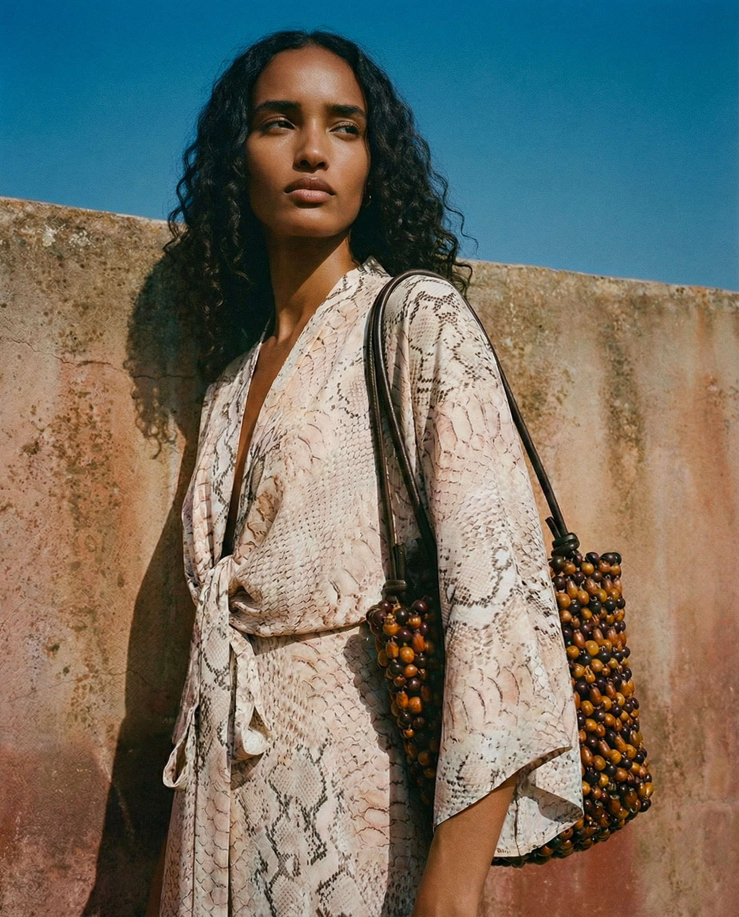
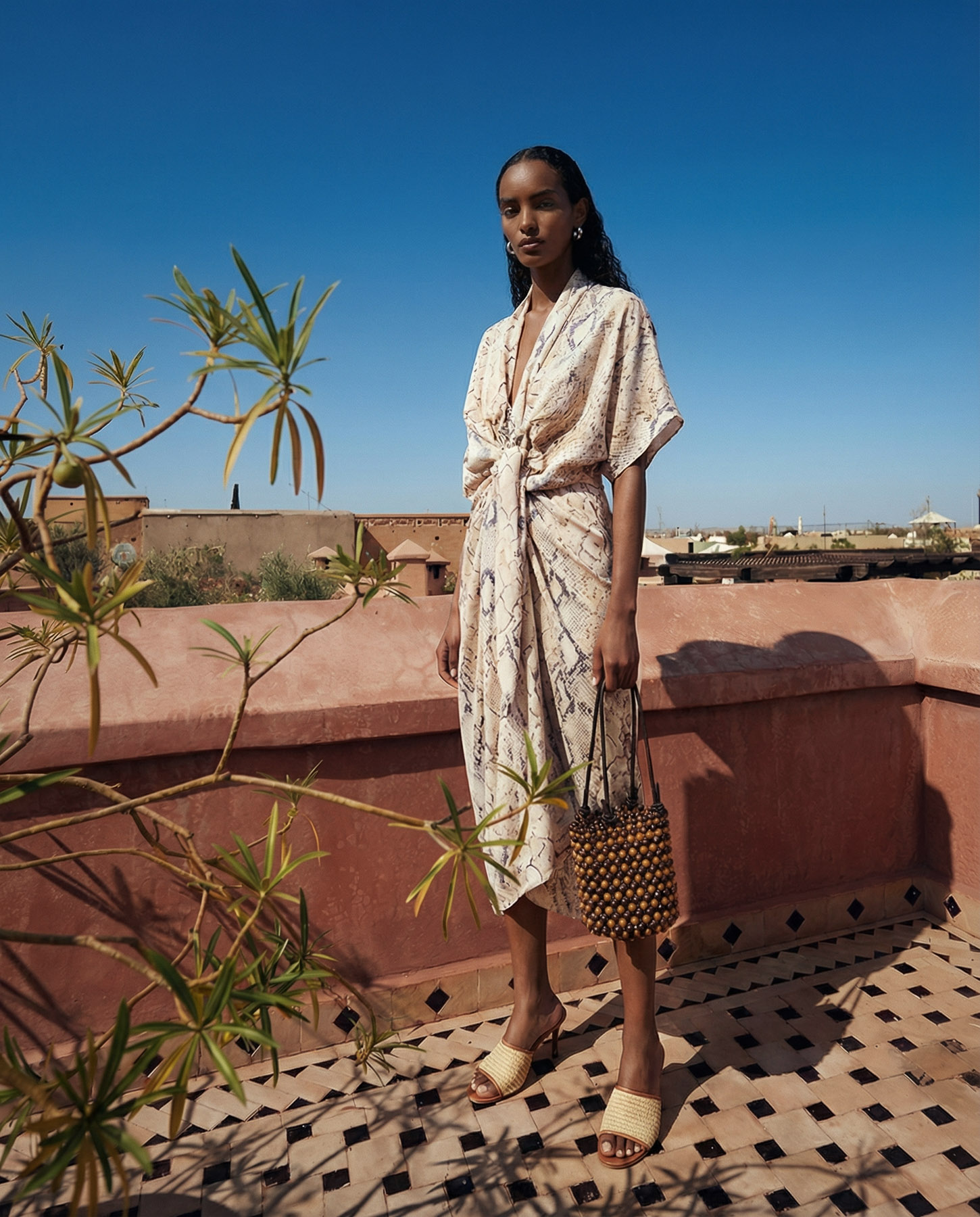
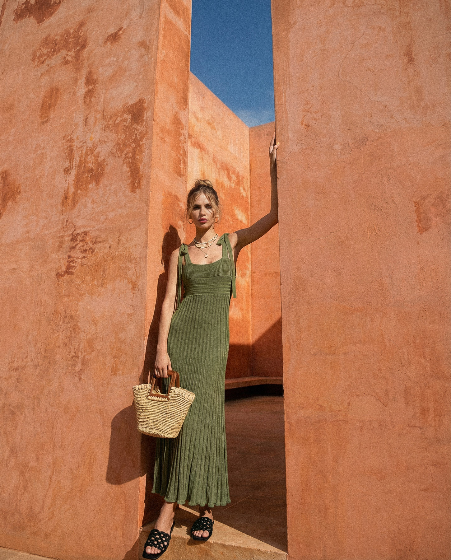
This case explores a summer campaign built around a distinct visual language shaped by the light, textures, and architecture of Morocco. The focus was to create imagery where the environment and the product work together, using warm tones, strong shadows, and natural materials to define a clear and cohesive aesthetic.
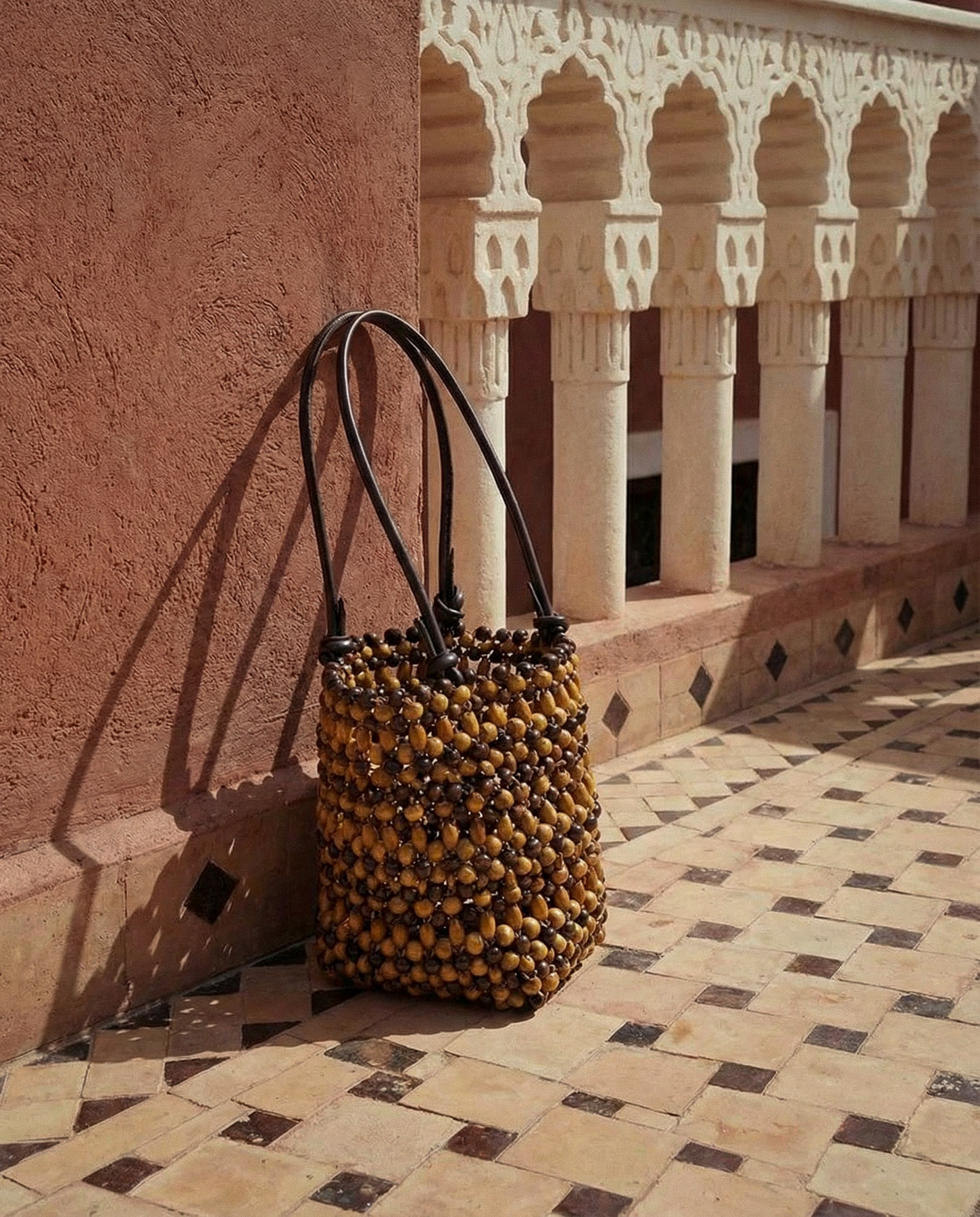
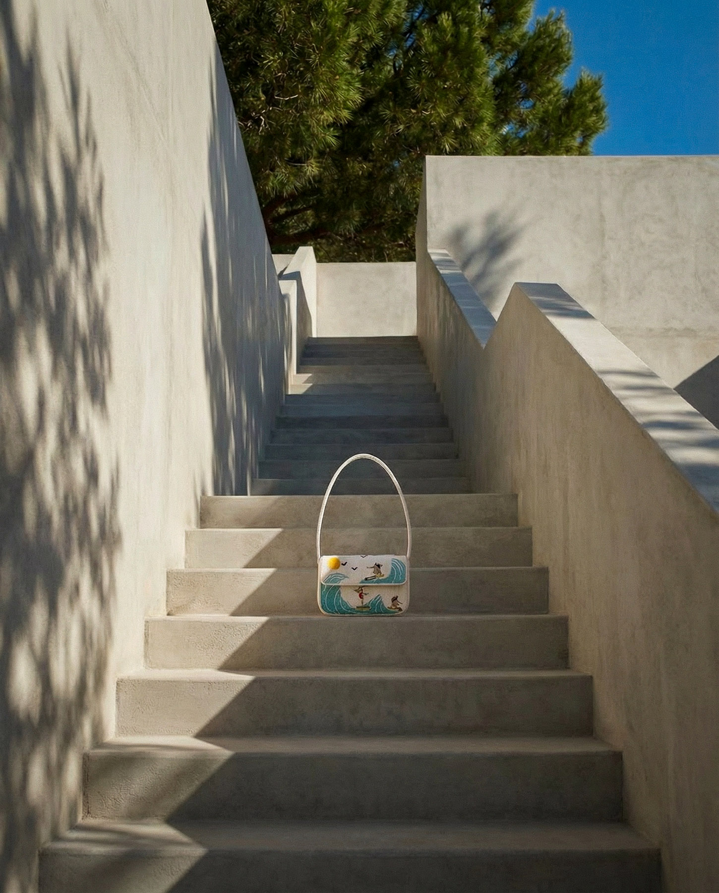
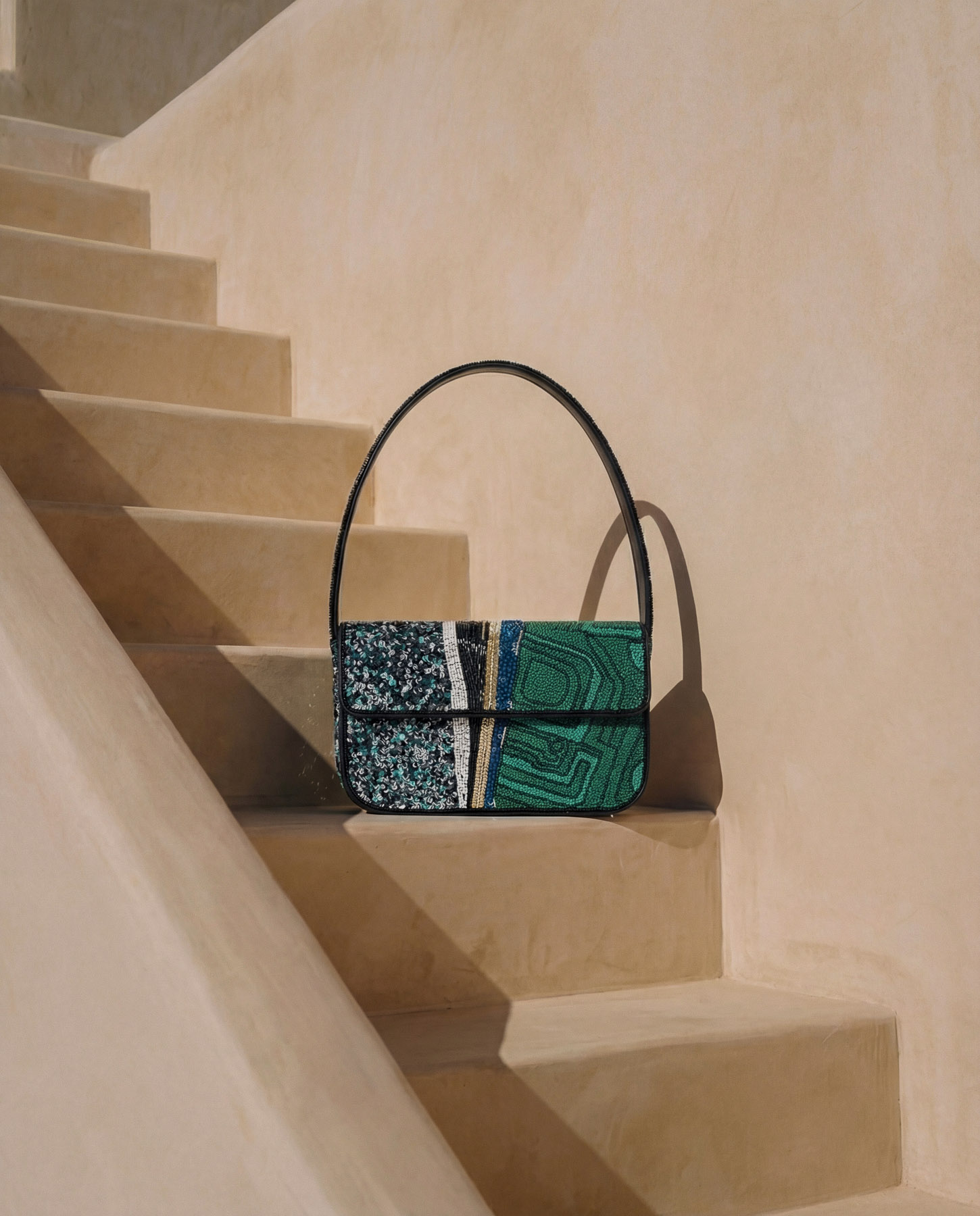
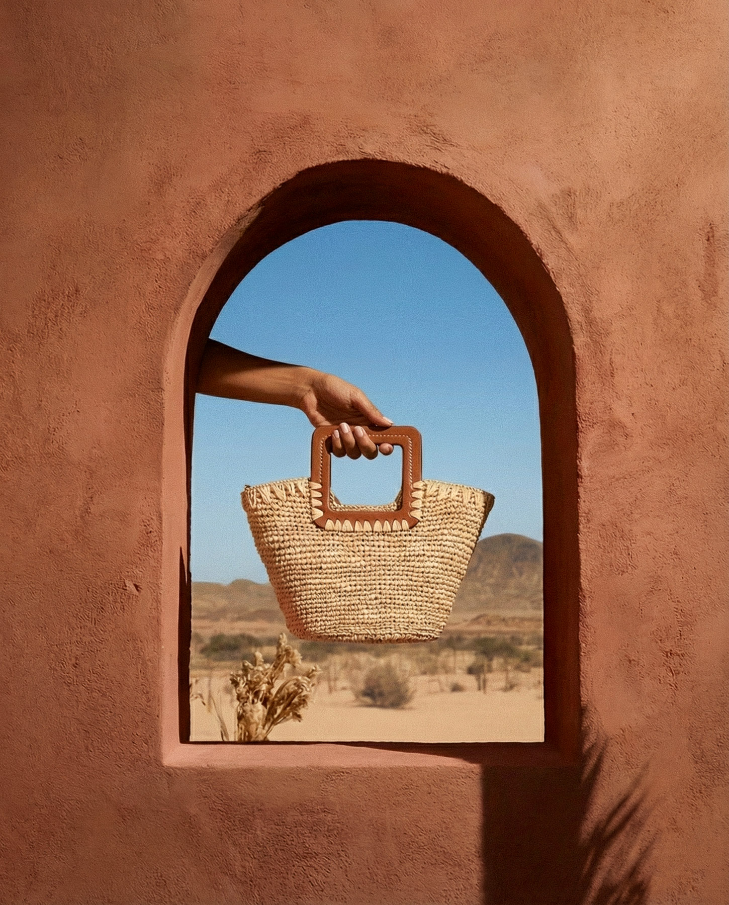
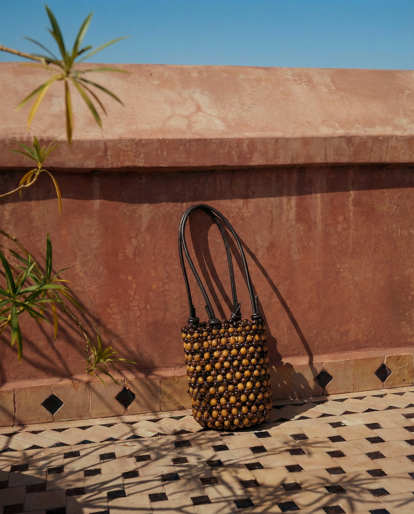
The visual direction is rooted in sunlit surfaces, earthy tones, and geometric compositions. Each image is designed to feel intentional and grounded, with the bags integrated into the space rather than added to it. The result is a visual language that feels consistent, calm, and clearly defined across all imagery.
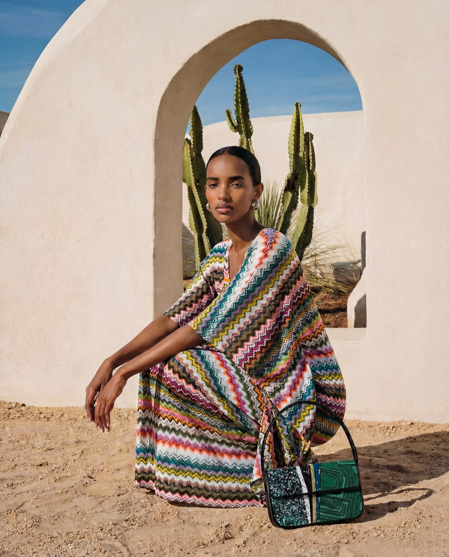
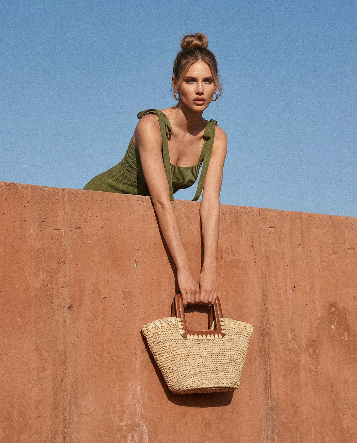
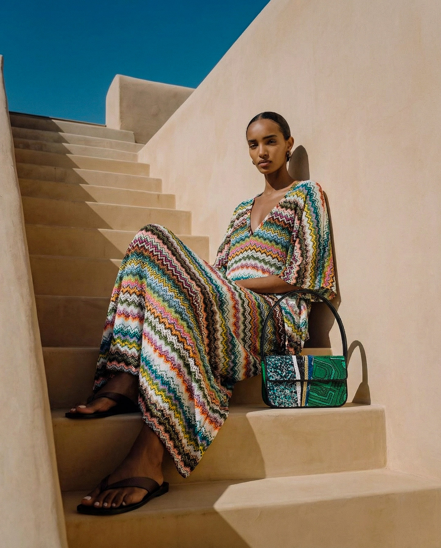
The campaign uses Moroccan architecture as a visual framework. Walls, stairs, arches, and terraces create structured compositions that guide the eye while reinforcing a sense of place. Light is used deliberately, with sharp contrasts and shadow play adding depth and dimension to each frame.
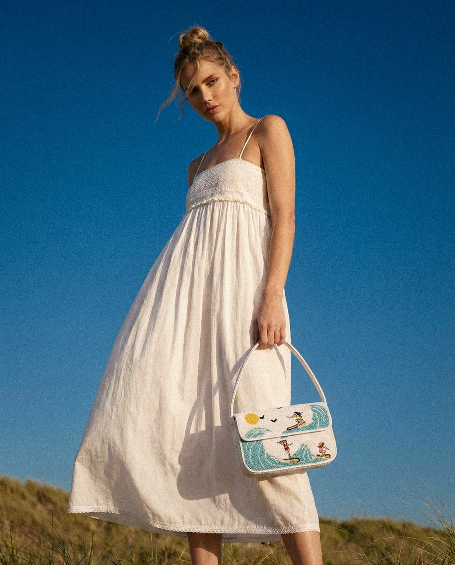
Styling and casting are kept minimal to allow the environment and materials to lead. Movement is subtle and controlled, creating a calm and confident tone across all visuals. The result is a balance between editorial expression and product clarity.


A consistent visual identity shaped by place
The result is a campaign built on a clear and recognizable visual language, where location, light, and composition work together to define the brand expression.
The imagery creates consistency across all outputs while allowing enough variation to keep the campaign dynamic. It establishes a strong seasonal identity that can be extended across channels without losing coherence.